


Special Feature
2024.04.11
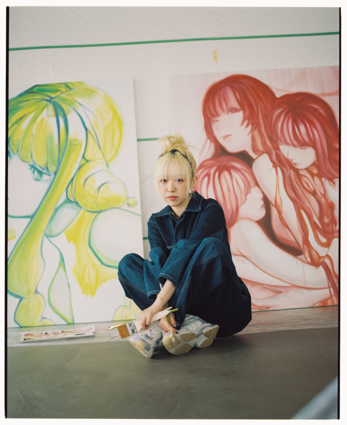
デジタルは「嘘」じゃないと気付けた──nina初個展「AfterBirth」インタビュー
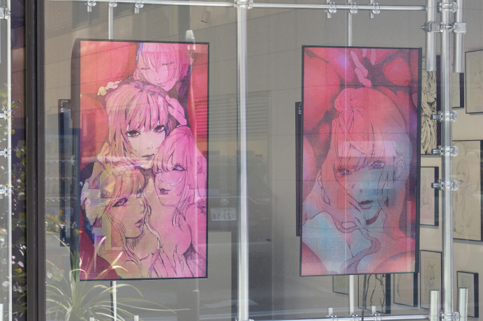
「AfterBirth」:生身のグロテスクさに、SNS的なフィルタをかける
──キービジュアルにもなっている「AfterBirth」と、対になっている「stuck in place」について教えてください。
「stuck in place」は自分のなかで、個展の準備を進めていく上での鍵となるビジュアルとしてイメージが固まっていました。1月ぐらいにはすでに描き上げていたと思います。特に今回は個展のテーマを表すためのモチーフとして内臓を使いたいと思っていたので、それをまずはアニメーションにしてみようと。動かしてみると、より「生きている」感覚だったり、空間の存在感みたいなものが表現できると思ったので。
「AfterBirth」については、自己と他者の境界が曖昧になっている人間の姿を描こうとしました。SNSなどを通じて、「大量の文字情報」として人間を感じることが増えていて、そんな中で生きていると、身体を持った自分という存在を忘れそうになることがあると思うんですよね。
──「自己と他者の境界が曖昧になる」と聞くとネガティブな感じもありますが、描かれている絵そのものは、肯定的でも否定的でもない印象です。
そうですね、どちらかに寄りたくはないと思っていました。「ただ美しく描きたい」というのが一番強かったのかもしれません。そういう現代に生きる存在を、きれいに均質に切り取りたい。なので、内臓的な表現についても、リアルな血の色というよりはちょっとマゼンタがかった色調にしてみたりしました。
──登場人物の目がハートになっているのも印象的です。
ハートは最初から意識していたわけではなく、描くなかで自然にこうなっていきました。4人の女の子が溶け合うように重なっているけど、実は自我を持っているのは中心の子だけ。ほかの3人は周りを取り囲んでいる、生きているか死んでいるかわからないゾンビみたいな存在。そんな風に捉えていて、そのコントラストを強調するためにハートにしました。
油彩画:「偶然」の質感を愛する
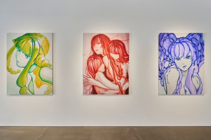
──大きな油彩画が3枚配置されています。油彩画は初挑戦と伺いましたが、なぜ描こうと思われたのでしょうか。
展示構成を考えている時に、一番大きな壁が丸々空いていて。最初は、デジタルでプリントしたものにペインティングして作品として仕上げようと思っていたんですが、せっかくフィジカルに寄せた表現をするなら、そちらに振り切った方がいいだろうということで、油彩に挑戦することにしました。興味はあったものの、完全に初めてだったので、油彩画の作家さんに教えてもらいながら描いていきました。
──挑戦してみた感想はいかがですか。
意外と自分に合っているなと思いました。アクリル絵の具と水彩画は取り組んでみたことがあるんですけど、あんまり得意ではなくて。すぐ乾いてしまうので、頭の中で完成形をしっかりイメージしてから、計画的に塗っていかないといけなくて、その作業が自分には合わなかったんです。でも、油彩はどんどん上から塗り重ねていけて、自分がいつも描いているドローイングにより近い感覚でした。
──3枚の作品について、どのように描かれたのか解説をお願いします。
最初に描いたのが真ん中の赤い絵です。これはキービジュアルと呼応していて、女の子たちが身を寄せ合い、ひとつに溶け合っていくようなイメージで描いています。
次に描いたのが右の青い絵で、いつもデジタルで描いているような感じで、ひとりの女の子にクローズアップしています。
1枚目は、教わった油絵のセオリーに則って、鉛筆で下書きを取ってから描き進めています。2枚目の方は、普段自分がデジタルで描くのと同じように、最初から濃い線で輪郭を取って、そこから面を塗っていくというやり方を試しました。
2枚目の方が、デジタルっぽい感覚で描けた気がします。最初から形を決めて塗っていく感じ。1枚目の方が、絵の具の重なりとか偶然性が出る描き方だなという違いは感じましたね。
──青い作品については、液体のような表現も特徴的だと思いました。
ドローイングの方に展示してある「Hedoro」というカラーの作品があります。先ほども話に出たツノの生えた女の子の絵ですね。それとリンクさせるイメージで、「Twin Hedoro」とタイトルをつけました。その名の通り、ツインテールの部分が溶けて体の一部のようになっている感じを目指しています。ちょっと毒々しい雰囲気を残したいなと思って、絵の具の垂れ具合なども意識して描きました。
──左の黄色い絵についてはいかがでしょうか。
これは3枚目に描いたもので、他の2枚との組み合わせを意識しました。2枚目の子が真っ直ぐこちらを見つめているので、この子はちょっと目線を逸らしたポーズにしています。このころにはだいぶ油彩のコツも掴めてきていて、絵の具の重ね方や混ぜ方がわかってきたところでした。黄色と緑を重ねているところなんかは、そうした油彩っぽい表現を意識して使っています。
──デジタルで描いたものと、油彩で描いたものの違いは感じますか?
かなり違うと思います。絵の具が垂れたり色が混ざったりと、自分の意図しない偶然的な表現が自然に生まれてしまうんですよね。でも、そういう崩れもむしろ愛せるなと思っていて。デジタルだと、ついクオリティの高さばかり追求しちゃうんですが、もっと自由に遊んでもいいんだなって。
──油彩は今後も続けていくのでしょうか。
そうですね、油彩はやっぱり物として圧があって良いなと感じるので、次はもっと大きい絵を描いてみたいです。
Exhibitions
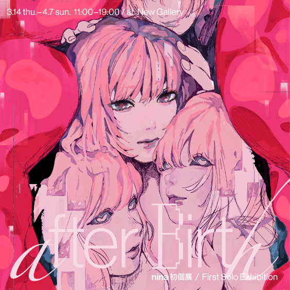
- nina 'AfterBirth'
- 2024.3.14 thu - 2024.4.7 sun
- Top
- Special Feature
- Digital is not a "lie" - an interview at nina's first solo exhibition "AfterBirth"
Special Feature
2024.04.11
Digital is not a "lie" - an interview at nina's first solo exhibition "AfterBirth"
"AfterBirth": Physical grotesqueness with a social media filter
—Tell us about "AfterBirth" and its counterpart "stuck in place", both of which serve as key visuals.
"stuck in place" solidified early on as a key visual that would guide the preparation of the exhibition. I had it completed around January. Especially for this exhibition, I wanted to use grotesque, visceral imagery to represent the theme, so I started with an animation. Animating it brought out a sense of life and presence in the space.
"For AfterBirth", I depicted humans whose boundaries between self and others are blurred. With the proliferation of SNS, we often perceive people as massive amounts of text data, which can make one forget the reality of having a physical body.
—Hearing "blurred boundaries between self and others" sounds negative, but the actual paintings seem neither positive nor negative.
Yes, I didn’t want to lean too far in either direction. I wanted to depict modern existence beautifully. Therefore, even with visceral expressions, I opted for a slightly magenta hue rather than realistic blood colors.
—The hearts in the characters' eyes are also striking.
The hearts weren't planned from the beginning; they emerged naturally as I drew. The composition involves four girls overlapping as if melting into one, but only the girl in the center has a true sense of self. The others are more like zombies, neither alive nor dead, surrounding her. This contrast is something I wanted to emphasize with the hearts.
Oil Painting: Embracing the Texture of 'Chance'
—There are three large oil paintings displayed. I heard this was your first attempt at oil painting. Why did you decide to paint with oils?
While planning the exhibition layout, one wall was completely empty. Initially, I thought of digitally printing and then painting over it to complete the works, but I decided that if I was going to make a physical expression, it would be better to go all out with oil paints. Although it was completely new to me, I painted while learning from an oil painting artist.
—How did you find the experience?
I found it surprisingly suited to me. I’ve tried acrylic and watercolor before, but they weren’t really my forte. They dry too quickly, requiring me to have a fully formed image in my mind and paint in a planned manner, which didn’t suit me. Oil paint, however, allows for continual layering, much closer to the feeling I get when drawing.
—Can you describe how each of the three paintings was created?
The first one I painted was the red painting in the middle. It corresponds with the key visual, depicting girls huddled together, melting into one.
The next was the blue painting on the right, which is more like my usual digital work, focusing closely on a single girl.
For the first painting, I followed traditional oil painting techniques, sketching with a pencil before painting. For the second painting, I used a technique more similar to my digital work, outlining boldly from the start then filling in the areas.
The second felt more like my digital work, starting with defined shapes. The first had more of the chance overlays of paint, which felt different.
—The blue painting also features a liquid-like expression that is quite distinctive.
It’s linked to a drawing displayed called "Hedoro" featuring a girl with horns. For the painting titled "Twin Hedoro", I aimed for a look where the twin tails seem to melt and become part of the body. I wanted to maintain a slightly toxic atmosphere, so I was mindful of how the paint dripped.
—What about the yellow painting on the left?
This was the third painting I worked on, keeping the other two in mind. Since the girl in the second painting looks directly at the viewer, I positioned this girl with a slightly averted gaze. By this time, I had gotten the hang of oil painting, understanding how to layer and mix paints. The areas where I layered yellow and green were where I consciously employed an oil-like expression.
—Do you feel a difference between your digital and oil paintings?
They are quite different. Paint dripping and colors mixing create unintended spontaneous expressions that naturally occur with oils. But I’ve come to love these imperfections. With digital, I tend to chase perfection, but with oils, I realized I could play more freely.
—Will you continue with oil painting?
Yes, I really like the presence that physical paintings have, so I want to try even larger paintings next.
NEW
GALLERY![]()


- Mail Magazine
- メールマガジンを登録していただくと、イベント情報・新着情報等をお届けします。
- Subscribe
- お問い合わせ
- 作品・ギャラリーについてのお問い合わせは
こちらのフォームよりお願いします。 - Contact Us
©2024 New Gallery
